What is Amor?
Amor is Signet Jewelers’ design system, designed to deliver consistent and accessible e-commerce experiences at scale across multiple brands.
The Situation
I joined the team after an agency handed off the initial design system. The original system included foundational elements: colors, typography, spacing, a small set of custom icons, buttons, and some form elements.
My Role
In my role, I focused on refining the visual language of the design system, creating reusable components in Figma, and collaborating with developers to implement them in Hybris, a cloud-based e-commerce platform. This also involved designing icons, comprehensive documentation, and outreach.
Challenges I’ve Tackled
Updating Colors
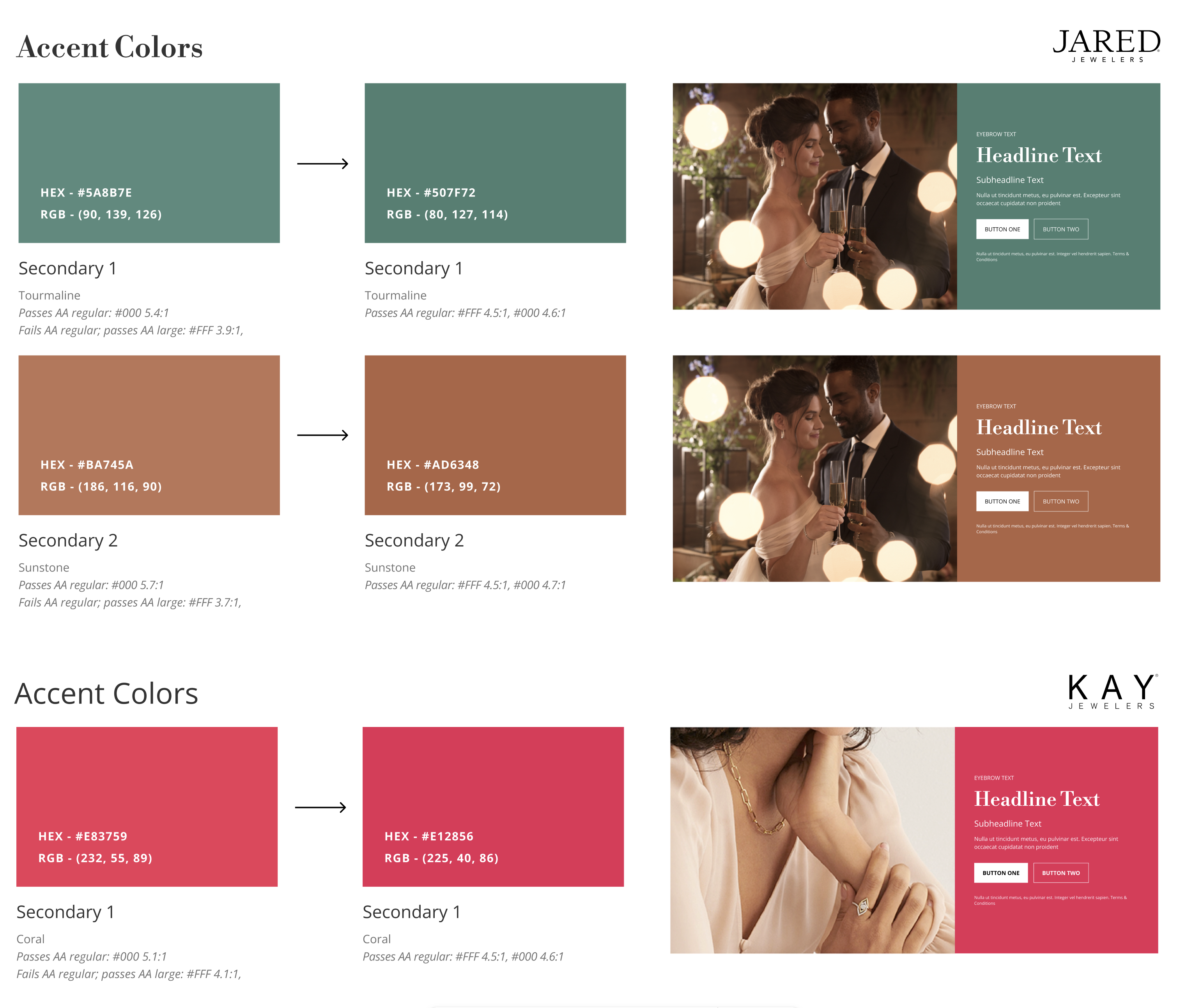
Joining an existing design system can be both a blessing and a challenge. While it gave the team a foundation to build on, it also revealed issues as we started working with the system. One of the first areas I tackled was the global colors. The agency had provided 8 neutral tones and a few supporting colors, but upon reviewing them, I discovered that only 2 of the neutrals met the 4.5:1 color contrast ratio. Despite this, all the colors were available for designers to use, leading to the assumption that they were suitable for any design context.
To address this, I refined the color palette by removing and adjusting colors, clarifying their use cases, and providing guidance on when not to use them. I also ensured the supporting system colors met accessibility standards and expanded the palette to include a ’warning’ color, as the agency had only provided positive and negative states. To help designers better understand the color guidelines, I created a clear and detailed color table to outline usage scenarios.
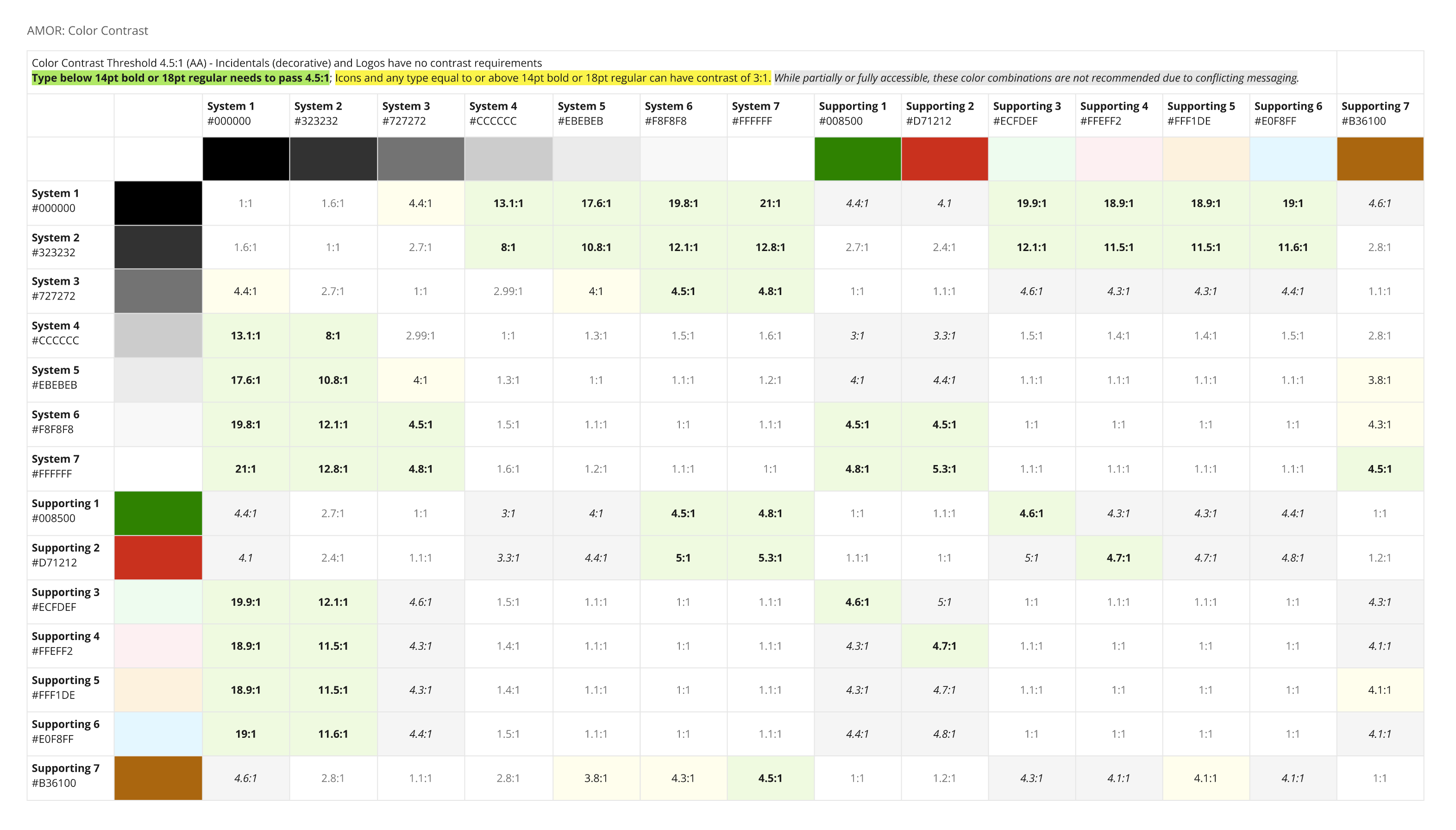
In later updates, I’ve worked closely with brand partners to educate and ensure their colors passed color contrast before they were used digitally.
Building Components
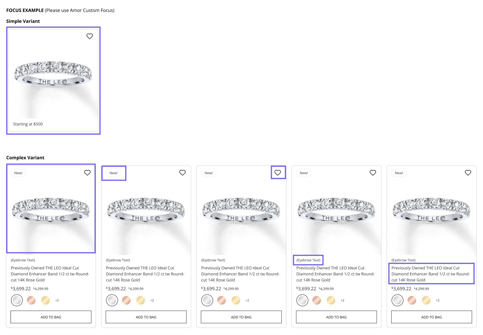
A major concern when building the design system was ensuring that it would not be overwhelming for our designers. A major breakthrough came with the decision to create a nested structure for components when we migrated over from Sketch to Figma. By organizing each component and its variants within larger, more complex components, I was able to streamline the system. This approach made components more practical to use and kept the number of variants manageable, improving both usability and scalability.
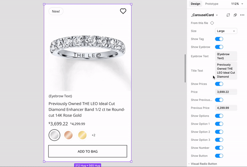
Given the complexity of some components, we collaborated closely with development to create different variants, ensuring they were optimized for screen readers and other accessibility tools.
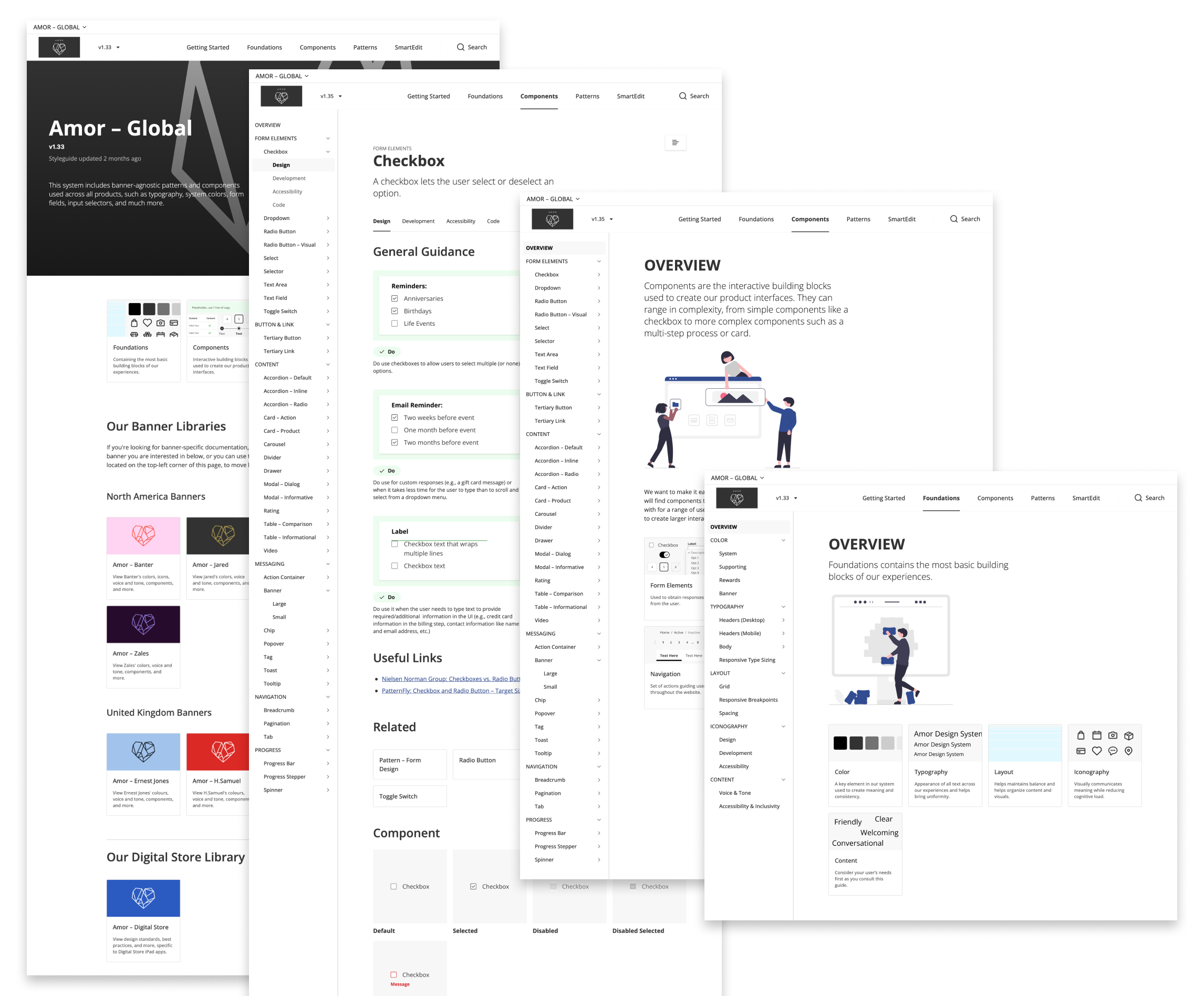
Managing Documentation
DSM was a great starting point for the design system, as it allowed us to get up and running quickly with built-in support for Storybook and token creation in one platform. However, as I continued building the system and the documentation, its limited formatting options became a significant challenge.
When exploring new documentation platforms, we narrowed our options down to Zeroheight and Knapsack. I advocated for Knapsack because it offered more customization and demonstrated a willingness to collaborate closely with its users. While Zeroheight had better features than DSM and was a tried-and-tested solution, it felt more rigid and less likely to address all our specific needs.
The decision felt reminiscent of the Sketch vs. Figma debate back in 2022: Zeroheight represented the established, reliable choice, while Knapsack was the innovative newcomer, actively listening to user feedback and adapting accordingly.
Leadership ended up moving forward with zeroheight, since it was the leading industry standard at the time (we were still on Sketch), and so the migration began. I migrated all the content from DSM to zeroheight and created visuals, and added illustrations to help it feel more approachable. The documentation is ever-evolving with new components, foundations, and visual treatments with each brand refresh.
Impact
Measuring this has been difficult, as we were moving forward without capturing baseline metrics. In a survey I’ve conducted for designers, with the help of our UX research team, some insights include:
- Designers save around 1/3 of their time utilizing the design system, allowing them to focus more on research and other factors. Time savings ranging from 3 to 10+ hours per week.
- Approximately 65% of their work is using the design system.
- There is a high level of satisfaction, especially among experienced designers (3+ years). Many designers praise the design system and the team. Criticism is constructive – most want to see Amor evolve, not replace it.
I’m also working with my development counterpart to survey the development team, hoping to gain more insights on how to improve and evolve Amor.
Anything Else?
Like any design system, Amor is a living, evolving language that grows with the needs of its users. To promote and support Amor, I’ve taken the following initiatives:
- Amor Contributor Intake – Designers can contribute to the system by submitting intake tickets. Each ticket is reviewed to determine if it aligns with the system’s goals. If so, I collaborate with product designers to bring their contributions to life.
- Amor Newsletter – At the end of every sprint, I send out a newsletter highlighting all changes in Amor across Figma, Zeroheight, and Hybris/Commerce Cloud.
- Amor Teams Chats – We established multiple Teams channels to foster open communication about the design system and Figma. These channels are used to share feedback, report bugs, ask questions, and collaborate across teams, enhancing visibility and contribution.
- Amor Office Hours – Time weekly for designers to chat with us on things they are working on, as well as provide feedback, and point out bugs in a more intimate setting. This has been extremely helpful for the newer members on the team.
- Design Critiques – In weekly XD (Experience Design) team meetings, I represent Amor and accessibility, raising concerns, sharing insights, and helping connect different product teams to ensure alignment.
- Dev & Design Weekly Syncs – Given that our developers are mostly outsourced, it’s created a unique dynamic at the company. I use these syncs to speak candidly with my Amor and Accessibility developers to align on the work we do. This is a more informal and collaborative setting than what our daily stand-ups and epic refinements would provide.