The Problem
Signet’s brand sites had no cohesive strategy for displaying promotions. Offers were repeated across pages, disconnected from what users were shopping for, and difficult to return to once seen. The experience was fragmented for both registered and guest users.
The result was user frustration, low engagement with promotions, and missed conversion opportunities. This was not from a lack of offers, but from a lack of structure around them.
The Question
How might we improve the promotions experience so customers see the right deals at the right time?
The Goal
Build a single destination for all promotions that:
- Centralizes all offer types, both discount and non-discount
- Integrates into the shopping journey without interrupting it
- Makes promotions easy to discover, understand, and return to
- Supports business conversion and customer satisfaction equally
Understanding the Landscape
Before designing anything, I, along with a researcher, ran a competitive audit of retailers, followed by multiple rounds of moderated user testing. Participants evaluated four concept variations across different promotion placements: a full new page, a side drawer, and two bottom drawer configurations, using real prototypes across our brands and othe retailers.
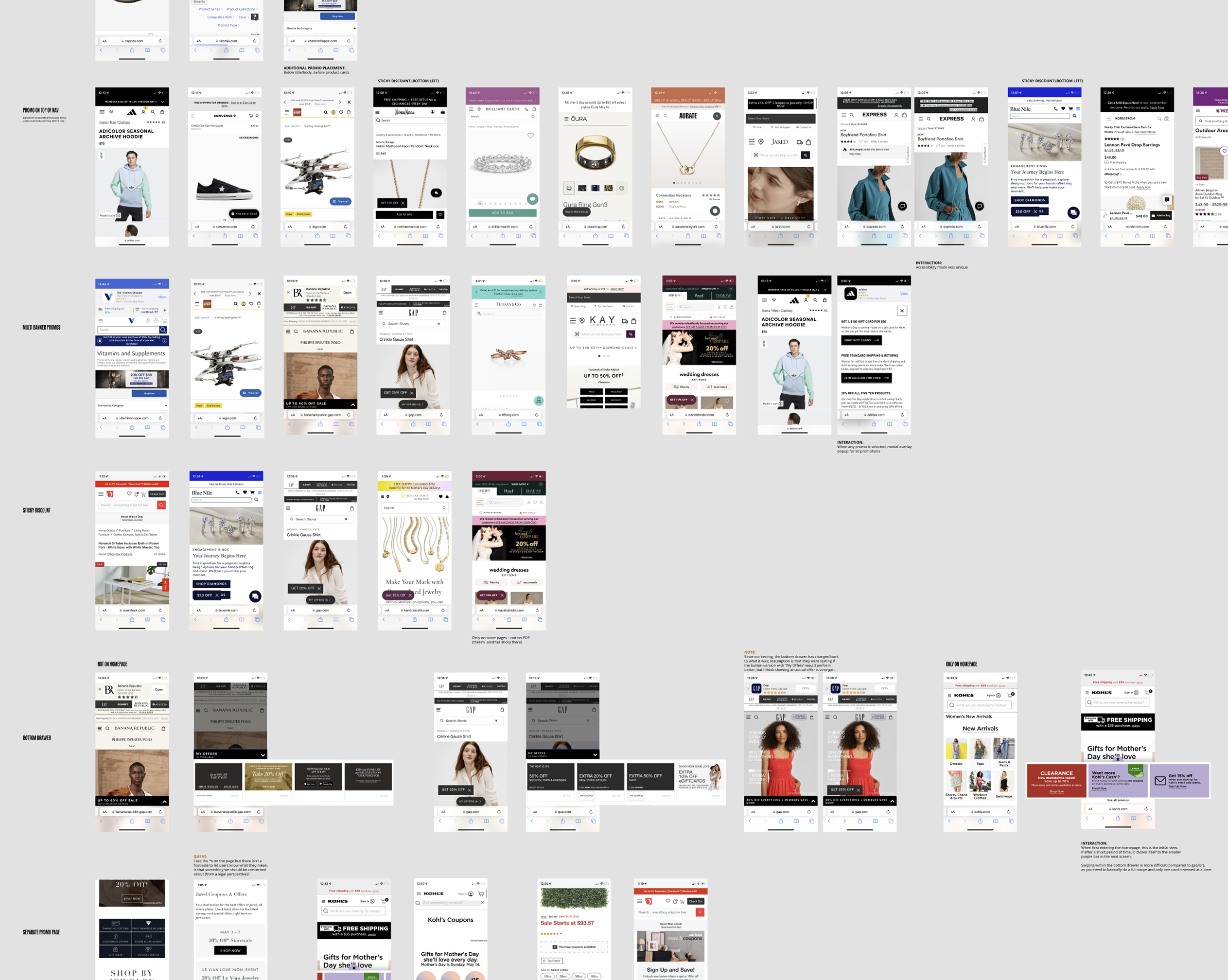
Four themes emerged:
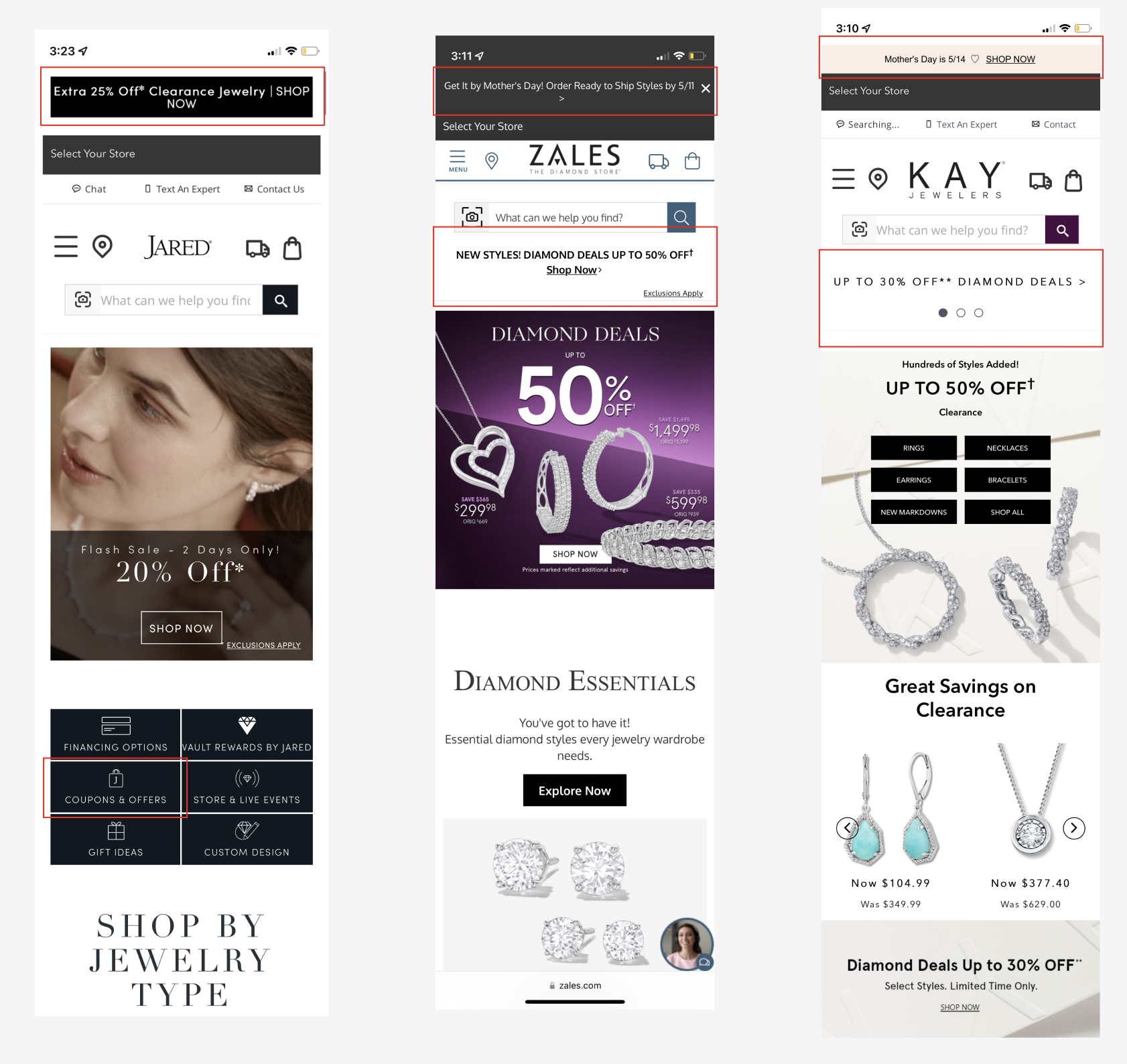
Placement matters more than prominence
- Users consistently missed the bottom drawer CTA, with many failing the task entirely without a tooltip
- The side drawer was the most noticed and the preferred layout, but participants felt the CTA took up too much screen space
- Most users did not want to be taken to a new page to see offers, feeling it broke their shopping flow
The consistent ask: make it accessible without making it intrusive
Too many offers erodes trust
- Most participants felt 4 to 6 offers was the right range. It was enough variety without feeling overwhelming
- Beyond that, perception shifted: too many promotions made the brand feel like it was struggling, or made individual offers feel less valuable
- Participants described seeing too many promotions as a signal that a brand “isn’t doing well or is trying to get rid of inventory”
When everything is a deal, nothing feels like one
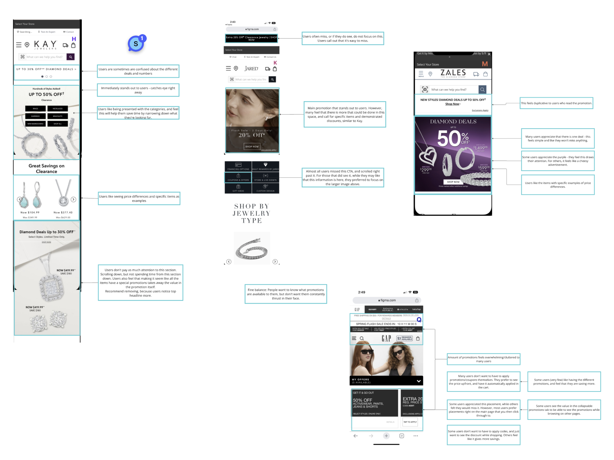
Simplicity and clarity build confidence
- Users wanted to see specific items, clear price differences, and straightforward value
- They did not want to compare, stack, or manually apply promo codes
Show me the best price upfront, automatically
Personalization is a meaningful motivator
- Nearly all participants said they would log in or create an account in exchange for more relevant, personalized offers
- However, most missed existing sign-in prompts during testing entirely, signaling the prompt itself needed more visibility
Personalization was seen as a reason to engage with the brand more, not just the offer
Main Takeaway
Users want access to a range of offers on their own terms. The experience needs to be easy to find, easy to understand, and easy to trust, without interrupting why they came to the site in the first place.
Decisions Made
Each finding had a direct design response:
Placement
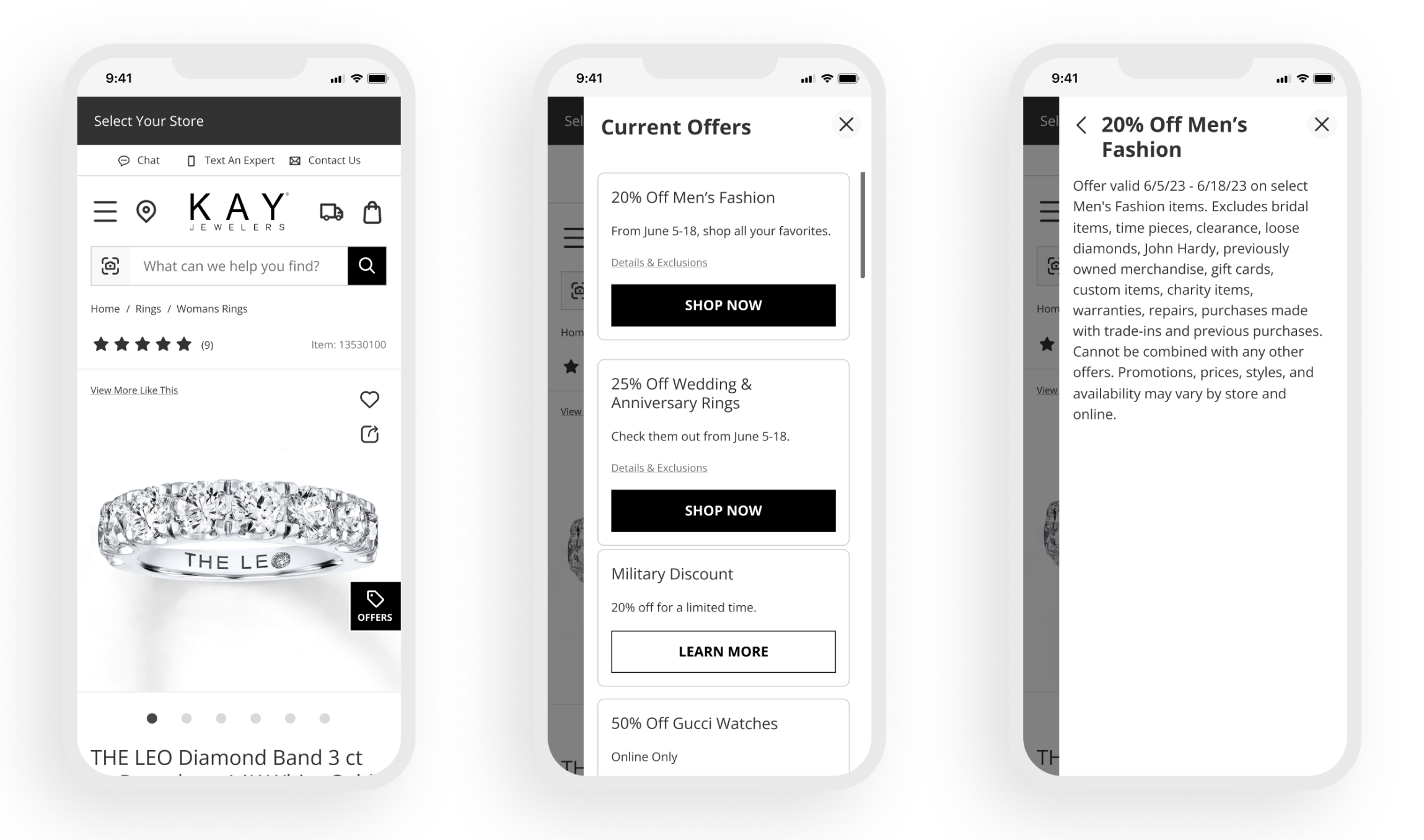
Iterate on the side drawer, reduce the footprint.
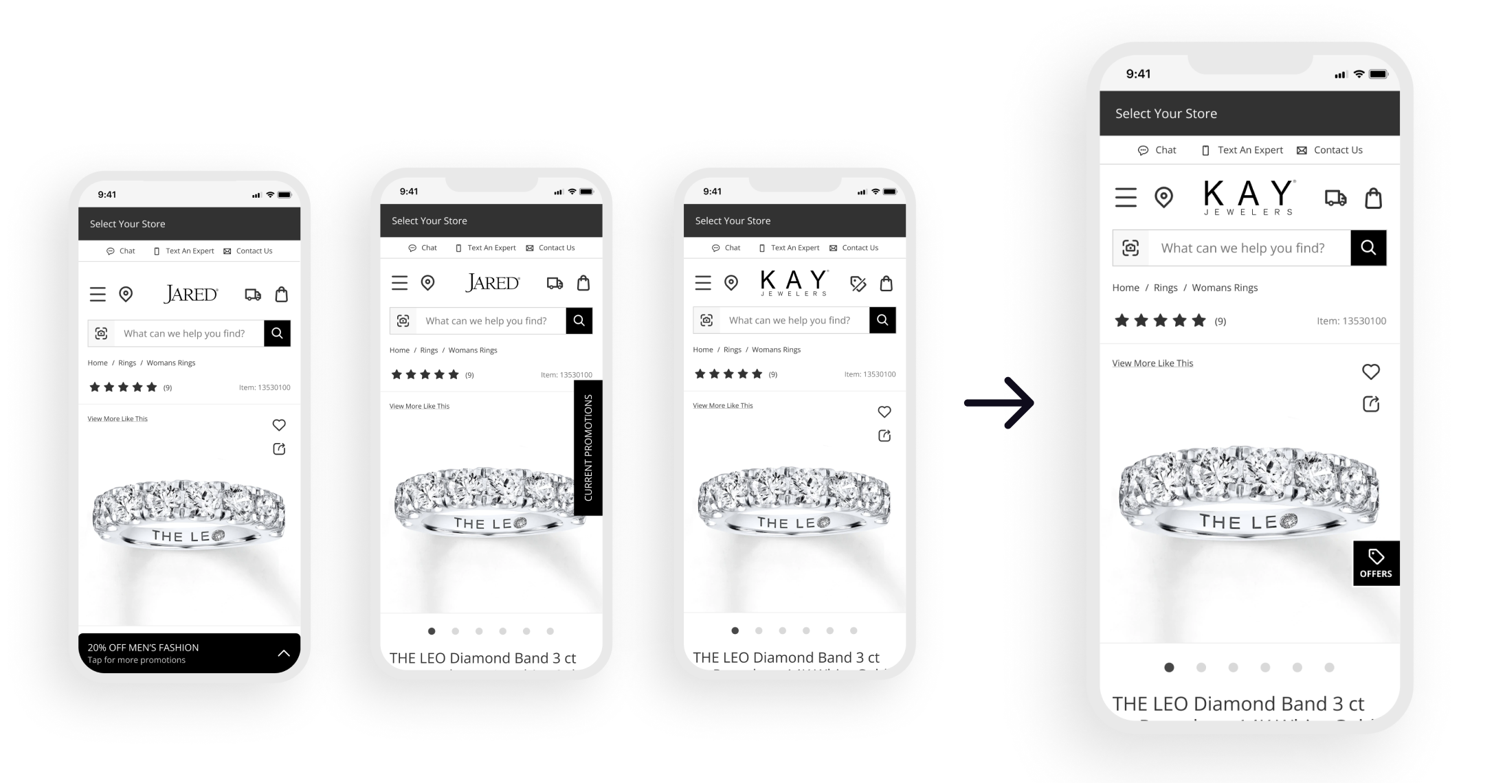
Research confirmed the side drawer as the preferred format, but called for a less prominent, more collapsible entry point. The final design retained the side drawer layout while exploring ways to make the CTA feel less like it was competing with the shopping experience
Number of offers
Testing pointed to 4 to 6 as the sweet spot, with 10 or more crossing into overwhelming territory. We capped the visible drawer at 6 offers with a clear “see all” option for deal-seekers who wanted to go deeper.
This respected the casual browser without cutting off the intentional one
Simplicity
Signet’s US brands already operate without promo codes, automatically applying the best price. Research reinforced this: users didn’t want to hunt, compare, or do the math. We leaned into that by removing friction rather than adding explanation
Personalization
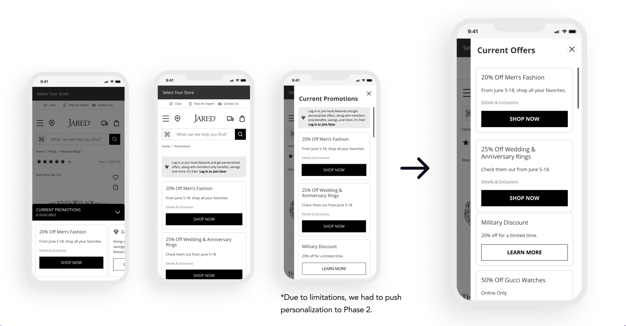
The appetite was clear and consistent across participants, but constraints meant it had to wait. We design for it and shipped without it.
A Parallel Track
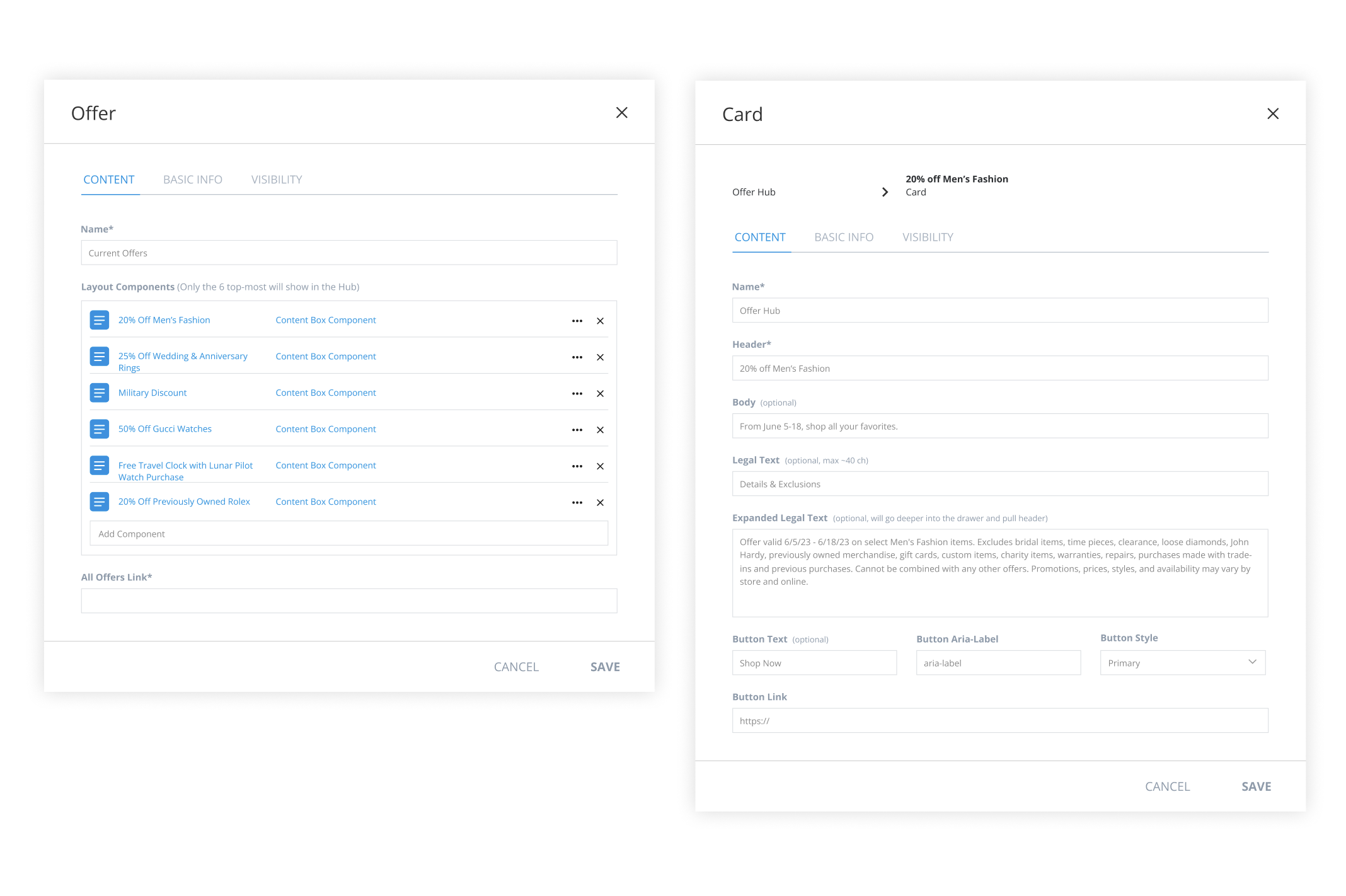 Because this was a CMS-powered experience, I also designed the brand-partner-facing admin view, giving brand teams control over which offers appear in the hub, in addition to the consumer UI.
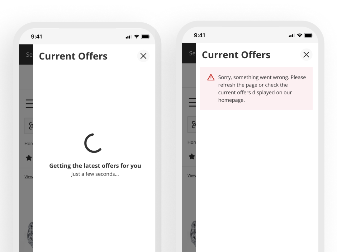 Late in development, the Dev Lead flagged that offers were taking a noticeable amount of time to load. I partnered with the content design team to account for that wait, designing a loading state and an error state so users always knew what was happening and where to go if something went wrong.
Impact
We were taking promotions that lived in highly visible, prominent placements and moving them into a drawer.
What followed was two rounds of validations.
Stage 1 · A/B test
~1 month on Kay Jewelers · Controlled split test · Oct 2024
Results were strong enough to move forward with full development.
Stage 2 · Post-launch
Real-world traffic · Full implementation across Kay · Feb 2025
Clickthrough dropped because promotions were no longer competing for attention across every page. The users who sought out the Offer Hub were there intentionally, and the revenue reflected that.
The drawer didn’t kill engagement. It killed distraction. Not every drop in clicks is a loss. Sometimes it’s focus.
What’s Next
Phase 1 was intentionally scoped to establish the foundation. Planned enhancements include:
- Personalization for account holders - the most-requested feature across research, ready for Phase 2
- Enhanced loyalty benefits - deeper rewards for members
- Promo code copy functionality - a specific need for Signet’s UK brands where codes are still required
- Color exploration - visual treatment to create emphasis hierarchy within the hub
- Integration with brand-owned offer pages - consolidating the CMS so brand partners manage both surfaces in one place, reducing duplication and improving consistency